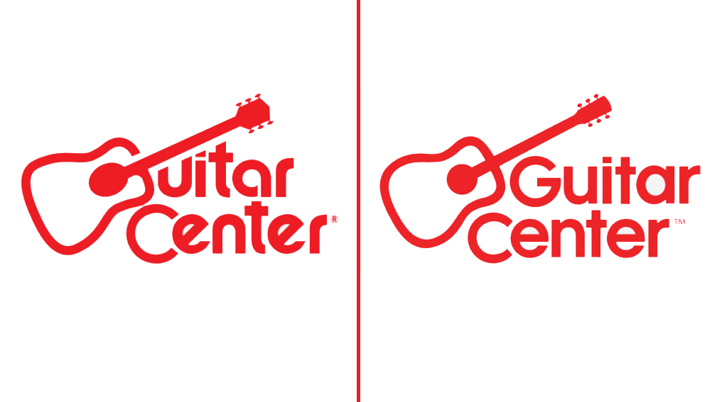
Stop what you're doing: Guitar Center has added a real 'G' to its logo
The shift is the first major change to the guitar retail giant's logo in over 50 years

All the latest guitar news, interviews, lessons, reviews, deals and more, direct to your inbox!
You are now subscribed
Your newsletter sign-up was successful
Anyone who uses Twitter will know that it, notoriously, is a forum on which anything and everything can (and probably already has) become the subject of vigorous, protracted debate.
To that end, Twitter's merciless lens recently fell upon the logo of guitar/music retail giant Guitar Center, which has stayed largely the same for the better part of 50 years.
In particular, some have recently been taking to Twitter to voice their discontent with the fact that a guitar was used in Guitar Center's logo to represent the letter 'G'.
Article continues belowI just feel like we’re being really generous letting guitar center pass this thing off as a G pic.twitter.com/8HuaFk5LEm
It's crazy to me Guitar Center uses this guitar as a G in its logo, because it barely looks like a G.Anyways, here's what it'd look like if other things used that guitar as a G. pic.twitter.com/3pmgcjSGao
Humorous as these critiques of the company's logo were, they aligned with the opinions of a number of Guitar Center employees, such as Jeannine D’Addario, who has served as the company's chief marketing and communications officer since 2017.
“It was designed in the ’60s without a computer, which is challenging when you move into a digital environment,” D’Addario explained to AdWeek in a recent interview.
With that in mind, D’Addario decided to – along with some other changes to the brand’s style guidelines – prioritize making some subtle, 21st century-minded changes to the logo.
According to AdWeek, the company spent six months or so giving its famous logo a small facelift, during which it found – via testing – that consumers clearly preferred the addition of a proper 'G'. It's now begun gradually shifting to the new-look logo in its official communications, and on its website and social media channels.
All the latest guitar news, interviews, lessons, reviews, deals and more, direct to your inbox!
“I joke that my legacy will be, ‘I’m the girl who put the ‘G’ in ‘Guitar Center,'” said D’Addario, who also said in the interview that Guitar Center is currently opening more stores, and hopes to have 300 in total in the United States (up from its current tally of 298) by the end of 2022.
Jackson is an Associate Editor at GuitarWorld.com. He’s been writing and editing stories about new gear, technique and guitar-driven music both old and new since 2014, and has also written extensively on the same topics for Guitar Player. Elsewhere, his album reviews and essays have appeared in Louder and Unrecorded. Though open to music of all kinds, his greatest love has always been indie, and everything that falls under its massive umbrella. To that end, you can find him on Twitter crowing about whatever great new guitar band you need to drop everything to hear right now.

